And so we are back
It is nice to be back... Sort of.
The Video Blog Link
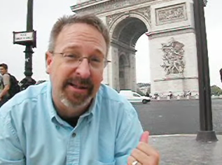
It is hard not to want to stay in
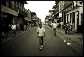
Paris. After a while it all goes by in a blur. You have to ask yourself, did I really see that or was it only imagined? There have been so many marvelous moments on this journey. It has been written that we travel as a way to expand each moment. Time stands still as you look in wonder at a familiar site that you have only viewed in your mind’s eye. There have been so many special moments. So many familiar monuments that have not disappointed. The Arc de Triomphe, The Louvre, Versailles, Notre Dame, The Tour Eifel, Sacre-Coeur, even Paris neighborhoods too numerous to even remember. Paris is such a marvelous place that has captured the hearts and minds of millions for a millennia. You can add us to that incredibly long list. For once, a town lived up to the hype and exceeded it. It is such a magical, mysterious, marvelous place. We were blessed to visit. And now it is time to come home. The long awaited journey at last comes to an end. Bittersweet at its conclusion, but forever savored in our mind’s eye.
I have been really surprised by the response to the
video blog of the trip. There have been so many positive comments and a bit of a landslide of hits on the site. Thank you for the kind words and support. It was an experiment that I think on the whole works. The process was really not as difficult as I expected. I created the web site before we left for Paris and then only had to populate the server with new files as I created them. Once again we shot little 320x240 QuickTime files on the Nikon still camera. The quality is rather crude, especially the audio and the footage in low light, certainly not what I get out of the HD camera we took. But the advantage of using a strictly file based production path far outweighed having to go through the hassle of capturing video into the computer in real time. All we had to do was move the CompactFlash card over to the PC, import the files into Avid and we were editing. I was able to bang out a finished piece in a little over an hour. Production value was not as important as being timely with the posting. We wanted each dispatch up on the server and ready for viewing on the same day we shot it. Shooting video with a still camera still has other liabilities besides the quality of the resultant footage. It would have been nice to have a tripod for the shots, but that went against the idea of being light and spontaneous. Besides, many of the venues we shot in would not allow a tripod so we were stuck with some insanely shaky footage. Again, I come back to the reason for creating these was to give a sense of the moment, not careful documentation of a location or essay on history. For that watch National Geo or Discovery.
One of the big problems was finding a good internet connection in Paris for moving rather large files. I did not have a connection as I wrote the individual pages and I could not check to see how the files played in the interface. As a consequence, some of the videos ended up odd sized, even though I compressed them in flash using the same settings. It was totally random and now that I am back I plan on taking a few minutes to drill into it and find out why.
If you have any comments or reactions please feel free to contact me directly. There is a link to my mail on the home page of the video blog. Let me know what you think. The feedback is always welcome.
Getting Ready for Paris

Well, we are almost ready for our trip to Europe. There is something special saying that your honeymoon will be in Paris. Looks like most of the plans are in order, and with any luck we will be out of here in a few days.
I prefabricated a web site for the trip. We are hoping to post short videos during the journey. A video blog of sorts. Since I didn't want to waste my time in France writing code I pre-assembled all the parts and uploaded the elements ahead of time.
The site is live right now, even though there is no content posted from the trip. Hey we haven't even left yet. The plan is to shoot one-take wonders on the Nikon and post them with nominal production. We will be shooting with the HD camera for the post trip video (warning: if I offer to make dinner, you will probably have to sit through the video. Consider submission is the price of admission.), but I don't think that will be competed for six months or so. It will be hard to get it done while I am in school. Not much free time.
Feel free to check out the site, especially at the end of September. I promise it will be memorable. Not necessarily good, but memorable.
Getting Hitched
Well somehow we survived the weekend. In all honesty, the wedding was a hoot. There were the notable failures and stinkers, and I did expect more people. But really, it went exactly as we planned.
There have been a few requests for the Seuss vows, so I thought I would post them here. I do not know if it the group was genuinely engaged by the verse, or if they watched in horror like driving by an auto accident. Darcy and I enjoyed them, and really, that is all that matters.
The Seuss Vows
Alex:
Some think marriage is just like a noose
But really I think it’s more like a truce
We’re gathered here to ---- let loose
Although what follows is a bit obtuse
And with apologies to dear Dr. Seuss
These vows are more like verbal abuse
Darcy, I’m asking a few simple things
Because getting married comes with some strings
We’re blessing more than just these two rings
You will get dinged on many things
Do you love him, is that the oath that you swore?
‘Cuz some gathered here will surely keep score
Darcy:
As surely as we all stand on this shore
I’m certain I’ll love him evermore
Alex:
Will you love and to hold
Will those feelings stay bold
Is that what we’ve been told?
Darcy:
I will love him, that’s my plan
I will love him as my man
I will love him like my clan
I will love him eating flan
Alex:
Man, clan, flan, plan
How about in your minivan?
Darcy:
I will love him in a van
Heck, I’d even love him in Sudan
Alex:
Will you do it forward from today
As we stand here by the quay?
Darcy:
Not just today but each and every day
From this love I will not stray
Alex:
Perhaps we should hurry so we can hit the buffet
Darcy:
I will take him when he is poor
I will take him when he is rich
I won’t push him out the door
It’s Drew’s star that I have hitched
I’ll be there when he is sick
I will be there when he’s well
I won’t hit him with a stick
In our home is where I’ll dwell
I will take him when he’s good
I will take him when he’s worse
I will take him when I should
Even if he’s bad at verse
Alex:
So if you’ve thought this through and through
And the man for you is Drew
And these feelings are quite true,
Do you take this man?
Darcy:
I do.
It is this man that I will love
It is this man that I will cherish
Alex:
Then it is clear
To us here
That these feelings will not perish
So then I ask you Drew
Will your heart stay true?
Drew:
Not to put the horse ‘fore the cart
What about the till death do us part?
Alex:
You can cart out that part
But you better not start
Till you’ve looked in your heart
Do you need a flip chart?
Drew:
I don’t need a chart
I don’t need a cart
I don’t need an external body part
I just know everyone here
Including my dear and that drunk in the rear
Know that my promise is very sincere
Alex:
Then if you'll take her as your wife,
And if you'll love her all your life,
And if you'll have, and if you'll hold,
From now until the stars grow cold,
And if you'll love through good and bad,
And whether you're happy or sad,
And love in sickness, and in health,
And when you're poor, and when in wealth,
And if you'll love with all your heart,
From now until death do you part,
Yes, if you'll love her through and through,
Please answer with these words:
Drew: I DO!
Alex:
Then I’d be certainly remiss
If I didn’t insist
That you give the girl a kiss
(But be sure not to miss)
Alex:
Since Darcy said she does love Drew
And we can tell their love is true
And all of us heard them say “I do”
I’m pleased to present Thing One and Thing Two.
Ladies and Gentlemen, Darcy, Drew and Family.
Summer Heat

Ahh, the respite of summer. School is done for a while and now I can concentrate on other life plans.
Class went well I think. Although writing two 3 hour lectures a week was a lot more work than I expected. I guess I forgot that graduate students are a far tougher crowd. You come in at the start of every class facing a group of people who have spent a disproportionate amount of time listening to lectures. They can tell when you are unprepared. I always had this dark fear of sharks smelling blood, circling my lectures looking for inaccuracies and lack of facts. OK, I exaggerate. But the fear of failure can fill the room in a stink of flop sweat.
The notion of cramming a class on the architecture and nuances of streaming media into 8 classes was a bit overwhelming for both me and the students. It is a ton of material to cover in an astoundingly short period of time. I have been of the belief that the hardest part of teaching is developing the course. Figuring out what I wanted to cover, how I would structure it and what to include took a ton of work. I would get an idea of what detail needed to be explored and then realize I needed better information. Just researching the details took a day or two for each lecture. I do appreciate the 12 brave souls who signed up for the class with no idea what would be included, what the structure of the class would entail and what they would carry away from the experience. Fortunately, I will not have to resurrect this for another year (assuming I have an opportunity to do this again, no guarantees.) Then the challenge will be to try and remember what I meant when I wrote a particular phrase or comment.
The nice part is now I can focus on more important things. Marriage is on the near horizon. Actually it is the very near horizon. The speck that was so far away six months ago is coming at me like a bus. Only two weeks and I jump in with both feet. I am very excited, but not without trepidation. Not about getting married. I am very excited about that. No, I hate parties and the wedding feels like one humungous party. Two hundred people. I am amazed at all the details I never considered. From table cloths to bunting, appetizers to sound systems, permits to pastors… it is a ton of stuff. I have this niggling voice in the back of my head asking, “What will go wrong and will it be funny?” All these life changes in such a short period of time. I guess a life lived well is a full life. I feel as if I have had an opportunity to live many lives and that makes me feel blessed.
Usability for Schmoes

One of the personal reactions I have when reading Kristin Zibell’s
article on web design is that so much of this research is about following the money. My point here is that so much of the information we have digested is about usability in the marketplace; how can you get the most eyes on your website, and consequently, sell the most widgets? Commerce is the catalyst that has fueled the explosion of the web. Commerce is what pays for improved bandwidth and a more robust infrastructure. And certainly even my employer is all about commerce. And while we cannot ignore the web’s driving force, I have to believe we risk losing the real potential of the web.
For me, something gets lost in this push to dumb everything down to pre-digested web nuggets… already been chewed content that is easy to swallow. On the third page of her essay, Zibell goes on at length about reducing the intellectual load on the user. I am uncertain if this is deeply superficial or superficially deep. I am aware that her focus is on navigation and ease of use. But on another level this is about avoiding the risk of challenging a user’s brain for fear they will choose to disengage from your site, clicking on the back button. If the web is a primary source of information, what does it say about us as a culture if our intellectual horsepower is 5,000 miles wide and 2 inches deep? Why not create content and design that provokes and leverages critical thinking? Sure, Aunt Bessy in her double-wide trailer in Huntsville, Alabama may not read it, but should her clicks be the arbiter of intellectual and creative standards for the web? If so, it seems we have set the bar awfully low.
OK, I admit, it appears that I missed Zibell’s point. She is pushing the common sense idea that a web designer needs to be proactive in anticipating an audience’s wants and needs. Design needs to be clear, not overly clever with an understanding that a designer is designing an experience for the user. I understand the common sense rationale that if a user is confused or frustrated he rapidly becomes an ex-user. We have all been there; sifting through an overly clever web site where it looks like the developer was thinking less about why a user is visiting the site and more about how bored he is with the current state of web design. I certainly am no champion of that sort of onanistic exercise. In those instances my motivation is focused more on leaving their site than admiring their interminable flash movie.
It is just that I interpret much of Zibell’s perspective on writing as the notion that clear communication on the web is all about simplifying the words so any old schmoe can understand it. Well, hey, if the schmoe doesn’t get a particular word then they have access to this really cool invention. It is called a dictionary. It even lives on line. If a word conjures up the essence of a complicated thought, I say use it. I don’t really care that Aunt Bessy is confused by the word obfuscate or ameliorate.
Really the root of this rant is that too much of web design theory is more about the McDonaldization of the web, a sort of intellectual fast-food, and this depresses me. The definition of usability should not be determined by lazy people and middle managers (especially when that is one and the same.) There is more to an intellectual experience than just commerce. And good design is less about flashy graphics and more about balance of thought and intent. All too often, design and usability on the web looks like it was designed by committee. Probably because it was.
To marry a pumpkin

I have recently posted two new Flash audio slideshows. You can
find a story about the process of creating a wedding invitation.

And
this one is about finding the perfect pumpkin.
The Poetry of Web Media
If a video is posted on the web and no one sees it, is it really there? OK, this is a half-hearted spin on the tree in the forest query. But the rhetorical question is still relevant. Who is watching what is on the web?
I do not deny Jonathan Price’s notion that an author must always keep the audience in mind. I have created too many flabby, unfocused, crappy documentaries on television that failed to keep this axiom in mind. Much of my personal work on the web falls in the extreme of narrow-casting. I often create media for an audience of ten or twenty specific viewers. I know who they are and why they are watching. If someone comes along randomly and grazes from one of my offerings that is fine. But they are not my target.
What I find interesting in this discussion about rhetoric is the difference in experience and purpose between the written word and moving media (by this I mean flash movies ala JibJab, podcasts, video blogs, streaming media and webcasts.) The fluidity and nimbleness of electronic text affords a genuine dialogue between the writer and the reader. A dialogue that moves like a tennis match on speed, with thousands of players whacking at the ball, only to duck an incoming volley and smack back another. A chaos of conversation where there is no end to the game, just players who watch the entropy, or join in and leave when they are tired. It is often game of words that may or may not advance towards a goal.
Moving media on the other hand is still an intrinsically observational form of communication. The voices used by the story tellers are certainly different than previous media (film, television, and cartoons.) But the complexities and tediousness of creating moving media is just as ponderous as ever. Instead of managing one voice (the written word) a media producer may manage four or five voices (narrative, pictures, graphics, music, and natural sound.) All advancing in concert towards a narrative’s conclusion. The dialogue between a creator and a viewer is that of call and response. A creator will post media on the web, and perhaps someone will comment on the story. But they will not abridge the original media, nor are they likely to capture it and repurpose it for another post. Those comments may spark a written conversation, even an entirely new video post in response. But it is not a dialogue using moving media.
I like to think of successful video on the web as poetry. Not because of its elegance, because much of it is anything but elegant. No, I think that many of the most successful media elements on the web are personal stories, shared in the first person, reaching an audience not with the traditional model of one-to-many, but as a more personal experience of one-to-one. An exploration of personal observations, insights, experiences and aspirations. Not unlike the difference between poetry and prose. For me, television and films are like prose, successful web videos are like poetry.
Perhaps this paradigm will change as bandwidth changes. As images begin to occupy a larger footprint on our screens, as frame rates improve and we lessen the choppy playback, as the web appears on our television instead of on our laptops then perhaps the scale of the voice used on the web will move back to the prose of television. But until then, the most successful moving media on the web is the poetry of the personal story.
Portal Update
The
media portal has been updated with a thumbnail menu that should make it easier to navigate. Let me know if you would like to see any changes (besides maybe adding some compelling media.) There are about 16 videos there for viewing, with a very random selection.
Click here to be connected to the portal.
NAB Day 2
 Click here for video
Here is the last of my three videos from Las Vegas and the National Association of Broadcasters convention. This one is far less entertaining, leaning much more on the facts. Or at least the facts as I see them. I think I ran out of funny by the end of the trip. The absurdities of Vegas were no longer amusing, only annoying. It is time to retire my Nikon for eng work, I beleive. It was a fun experiment, but the audio was too hard to work with and it was nearly impossible to get a well-exposed, steady shot. But now I can say I tried it.
NAB Day 1
First day on the floor and
here is my vblog from the day. Lots of silliness for sure, but there are a few brief moments of actual content. Sorry for the audio and lighting. Next year I'll stay light on my feet, but my expiment with the Nikon is only margianlly successful. Too much of the audio is largely useless.
NAB Day 0
Here in the land of sun, sand, polyester and bad hair. I am in Vegas, baby. I arrived yesterday, click here to see
day one of the video blog. I made this one mostly for my kids. But video blogging certainly is fun, if not challenging for all the technical snafus. I am shooting not with a video camera this time, but with my
Nikon 5700. It runs only at 15 frames per second and is impossible to hold steady. I am leaning on anything I can find to hold it steady. And the audio is often impossible to understand. But on the whole, it works. And no one suspects you are taking movies when you are shooting.
Furby in France

OK, I don't know how best to explain this. My daughter has this really
cool little camera that shoots these uber-low resolution videos. She has started to story-board and shoot little movies with them, editing them with iMovie on the Mac and posting them on the web. The result,
Furby in France.This has all the makings of a cult classic. Bad accents, characters randomly chainging, lighting that is currious at best. It could be the next "Star Wars Kid". Or not.
Weeners and Losers
Weeners
Here are a few of my favorite storytelling sites:
http://www.time.com/time/photoessays/
Time Magazine’s photo essay section is a very strong representation of how images and sounds can be combined to create powerful stories. Of the myriad of websites devoted to multimedia storytelling, Time.com's packages engage users by telling stories in ways appropriate to this medium. The photojournalism is consistently impeccable and well edited. Time.com's high-impact images combine with intense audio, particularly in "21 Days to Baghdad," drawing the user inside the story. Interface design and navigation are straightforward and never gimmicky. There is a reason why Time’s site won the National Press Photographer’s Association Award for Best Use of the Web in 2004 (winners for 2005 will be announced shortly.)
http://www.washingtonpost.com/wp-dyn/content/photo/?nav=globetop
The Washington Post has done a remarkable job leading the industry in photojournalism and multimedia. This is what the New York Times is aiming for. While their current style no longer pushes the envelope of online journalism, the approach is classic and clean, reminiscent of a print style of presenting information. Check out the “Raising the Stakes" narrated gallery for a quick introduction to how they use Flash to mix images and audio. What I find particularly interesting is the Post’s significant commitment to short documentaries. They are venturing away from traditional print medium (text and photos) to video production. And they are doing it well. I find there are times where I can get lost in all the features. Now if only they could dump all the ads cluttering the edges of the page.
http://www.jacksonville.com/special/jamesCroft/jamesthegiant.html
For a totally different spin, “Walking with the Giant” is worth a look. This is a multimedia feature article from the Florida Times Union in Jacksonville. They broke the story into three smaller segments, making it a little less daunting for the viewer. I am not too hot on the pink, grey and light blue palette, but I guess one can’t really argue taste.
Stinkers
As far as stinkers go, there are so many to choose from. Two that come to mind are:
http://www.seattleweekly.com/ Oh the clutter and all those little boxes
http://www.guardian.co.uk/ The Guardian is all about the text. Just the facts, lots and lots of them.
Our Digital Campfire
A good story is about the human experience. It is about what it means to breathe on this earth. And whether the trials of that human experience are monumental or minuscule, if the listener, reader, viewer, or visitor cannot understand the voice of the storyteller then it is all a lot of wasted words, images, and digits. A good story teller must have a voice. That voice should have passion. Passion for the truth is wise, but not a necessity. A storyteller may show their passion by exploring the motivations and choices of their characters. Passion can present itself in the author’s choice of genre, or their love of the subject. But a storyteller must be passionate about their story.
Kimberly Appelcline writes about the craft of writing. She reminds us of the need to craft a potent stew of setting, character, plot, backstory, and detail when we write our stories. And while those five elements are the foundation upon which we build a narrative, our stories will feel somewhat like obituaries unless as authors we find our individual voices. As we write we need to ask ourselves such basic questions as, “Who is my protagonist?” “Who is my antagonist?” “What is my narrative arc?” “Are there any moments of decision?” “Where am I headed?” and the big one, “Why the hell would someone care about this story?”
The web uses words. But it also uses pictures. Far too many of the sites I visit don’t have a clue how to use the power of imagery to convey a story. As the web drifts aimlessly into the realm of video, it is being steered by people who write, not by people who understand the balance of words, sounds, emotions, and most of all, images. I am tired of pedantic talking heads. I am tired of getting my facts in a sound bite. I am tired of shaky cameras in a postage-stamp-sized window. Tell me a story with words AND pictures. So you have a great story tell. Terrific. What are you going to show me? Not another schmoe sitting behind a desk, I hope. And not some nabob planted in front of a plastic office plant. And please, oh please, not some nare-do-well sitting on the sofa backlit by a picture window where they look like a participant in the witness protection act. Give me a glimpse into people’s lives. Let me see what they make for dinner. Let me see them drive to work. Let me see them struggle with life’s many challenges. Let me see how life can be messy and cluttered with the emotions of change.
I just want stories where the author has a point of view. Tell me a story. Make it have a beginning, a middle and an end. Help me to understand why you told me your story. And most of all, make me care about it.
New York Times Video Rant
As part of their redesign, the New York Times has included a rather significant section of original video stories. Well they are almost video stories... They are rudimentary clips with rather ham-handed production value. It reminds me of what I see on high school web pages. The stories are constructed very simply: a talking head with still photos chopped in to illustrate a point. I am guessing there are no dissolves either because: a) the number of key-frames needed to stream a dissolve exceeds the bit-budget for their files, or b) the intern editing these stories has yet to discover the effect. These stories appear to be a natural evolution from the effective Flash audio/photo packages they have been creating for the past few years. But it appears the folks at the NYT are quickly discovering that while making TV is not that difficult, making good television should best be left to the professionals.
Three examples from today's postings include:
1) Reporter Linda Greenhouse discussing the Padilla case while seated in front of a dreadful photograph of generic file cabinets. The lighting on this looks somewhat like the Spanish Inquisition (or at least the way the lights would have looked if they had electricity in the 15th Century.)
2) A concert by 17-year-old songwriter Sonya Kitchell. I am sure this seemed like a great idea initially. Give a little sample of her music by taking 3 consumer-quality cameras and videotaping the show. The only problem is only one of the operators appears to have ever used a video camera before. The exposure is different from shot-to-shot, some of the framing could best be described as curious and someone needs to introduce one of the camera operators to a tripod. The interview is well lit, but they did it in a noisy room and some of the background clatter makes it hard to understand her interview over my computer's speakers. A user isn't going to view this on a television, and the audio mix should reflect the technology most likely used for display. The editing is better with sound-ups and cross fades, but the slo-motion section in the middle is a clumsy cheat for not having video to cover the song they are playing.
I3) n the "Vows" section we get a story about how a couple met, reminiscing as they prepare for their imminent nuptials. The interviews are lit well, and (mercifully) they used a tripod, but after watching the story I was left with the question, "Why do I care?" This is a home movie posted on the New York Times. Its placement gives it the same gravity as the Padillia case, where clearly it is little more than a wedding video.
As with any new technology, there are bound to be growing pains. But what pains me is this is an example of an organization feeling compelled to ignore the narrative structures and production values that have been evolving for 60 years. They are not breaking the paradigm with a new voice, but instead they are ignoring the basic tools the audience expects for effective and engaging content. If I were Leonard Apcar, I would seriously question if this feature was adding value to my paper.
OK, I'll stop ranting now.
Wasted Bandwidth
OK, this has nothing to do with school so feel free to skip this post.
If you are still reading then perhaps, like me, today you have too much time on your hands. Washington Post tech writer Rob Pegoraro noted a few clever and well crafted April Fools Day jokes from the internet. Here are three favorites:
1) Google Romance A tour of this online dating service explains how it all works. The FAQ is particularly funny:
"When you do a Soulmate Search, your deeply personal and potentially life-altering search results are produced solely by computer algorithm, without human intervention of any kind. Note: Depending on your personality, you may or may not find this reassuring."
I think the best part of the site is the self-effacing humor about the ads in Google.
2) Not unlike the send-up for Google Moon where as you zoomed in closer you discovered it is really made of cheese, the folks at Google also planted a treat for users of its Google Earth software. Pegoraro instructs us to search for "Area 51," zoom in, pan to the left until you see two fighter jets on the tarmac, and you'll also spot two friendly visitors. (If they have removed it by now, this blog post has screenshots.)
3)The last one I am afraid must be gone by now. Pegoraro writes that,
“The prolific tech-news site Slashdot made itself over for the day, changing its traditional dark-green banners and heading graphics to a shade of hot pink. Its usual ‘News For Nerds. Stuff That Matters’ motto was replaced by ‘OMG!!! Ponies!!!’”
The entire article is worth a quick read.
Finally, I would guess many of you saw the Openoffice.org announcement that Microsoft (BillG, specifically) had purchased the application. For those Linux users who were a bit slow on the uptake, the mailing lists were buzzing with the news.
Everybody's Got A Story to Tell
Stories
A good story for me is about the human experience, the trials and travails of making a contribution to the human race. Native American storytellers, autopsy instructors, Vaudevillians from the 1930s, authors, radicals, mothers, fathers, even transients… everyone has a story to tell. Some are tragedies and some are little victories, and a few, very few, are triumphs. For me, a story is a story if it captures the spirit of a life well lived.
The genres that capture me are history, culture and politics. But current climate of politics in America is so toxic I can’t imagine finding the passion to tilt at another windmill. So my third choice would be human interest feature stories. OK, I know, every story should have some element of human interest. Otherwise, who would read it? But these are stories told in the first person by people on the cusp of a decision.
For History I usually read a rather academic site called HNN (The History News Network) run by Seattle author Rick Shenkman. Rick is a former managing editor for KIRO-TV and a wonderful bestselling author. This site acts as a sort of aggregator of news and opinion, with pointed reflections of how current events are shaped by our past. The essays are usually well crafted stories about the ever changing fabric of America.
Culture and the arts usually starts at the New York Times. Granted, some of the writers craft articles that are very elitist, but on the whole, if you are writing for the Times you know how to write.
And finally, for human interest on a truly global scale I love The Witness Project. This is an organization teaching folks from oppressed countries (in often hostile environments) how to document their lives and turn their stories into documentaries for a worldwide audience. From Vigilantes at the Border of America, to Torture and Displacement in Northern Uganda, to Forced Labor in Burma, Witness opens a window in worlds untouched by corporate media.
CMS
Content management seems pretty clear to me. Like anything, you have to have a plan before you start. Spending the time up front imagining how the data will be leveraged by both the users and the creators is critical. My CDs are listed alphabetically and cross referenced by genre, my photos are sorted by type and organized by date, my car keys hang by the door; the user base is small (me) and I can find what I need quickly. Fortunately, very few others need to access the data, and when they do I can act as the content manager. Consistency in naming and organization is a must, because writing an application that will cull through your data needs to be simple, and including a list of special exceptions as to how it finds the data would be a train wreck. The two points made in our reading that made me smile was: 1) the admonition that if a CMS solution requires you to reformat your data something is wrong either with the folks selling you the solution, or how you organized the data in the first place; and 2) your CMS broker needs to have the ability to time when pages will be added to the site. I sure wouldn’t want to be up at 2am loading pages. Ugh.
Spring into COM586
The first post I write for this class
Will be something that could be quite quite crass
It won't really be clever
You'll all say, "I never!"
This poem will be just a morass.
I fear we will do too much reading
Some Visene is what I'll be needing
Just oodles of text
Will keep me perplexed
My garden will still need some weeding
For class we must write about change
But it can't be "Home on the Range"
Like something that worsens
Or things, place or persons
Or maybe the currency exchange
The homework’s a monster to feed it
I don’t know if Kathy will read it
I’ll make up some verse
‘Bout topics diverse
Uh, Canis meus id comedit
Home Movies Continued

This is yet another post of no real consequence. I had an opportunity to hit the ski hill at Mission Ridge this weekend, and just for fun I started shooting little movie clips on my old point and shoot camera. I say old, because there is a short in it so sometimes you have to smack it hard to get an image. The microphone is a teeny-tiny hole in the front so the audio is rather dubious, and there is no zoom when you are rolling, so the framing on the shots is totally random. Still, I find the video rather amusing, in a home-movie kind of way. Feel free to
take a look at my folley.
The page uses flash, and even though it is a progressive download, it might take a while to view if you are on a dial-up connection.
The Devil is in the Details

I love the opening line, “With the legwork and planning of the site essentially completed…” Hah! We are still struggling with our personas and vision statements. At least reviewing the complexity of what is before us should really help to light a fire under our collective tail. I do like the idea of coding each page only once. Not that I have ever managed to get the code of any web page correct from the get-go. But I do like the idea of having the structure, the architecture, the design, the audience expectations and the content clearly defined and prepared prior to coding. For me, the best part of the article is the client spec sheet idea. I know from my experience it is absolutely critical to create a document outlining the specific expectations of both the client and the vendor. All too often the scope of the project changes and someone will need to pay for that implementation. A clearly defined and agreed-to document drafted up front will give you solid ground for requesting additional resources for creating any deliverables changed by the client.
OK, this is really granular. What browser displays 64x480? I know 640x480 is standard NTSC 4x3 space (displayable on a television.) Is the 64x480 a banner ad? Or is it a typo? If it is a typo it is repeatedly used in the Spec Sheet.
If there is one thing we all take away from this week’s reading, it is that as we enter into next term we will need an agreed-to production timetable. If we want to be live in week 10 of Spring, we need to have our site fairly functional by the end of week 7 to allow for two weeks of testing and tweaking (a site never works correctly right out of the gate.) That means that much of our content and final design will need to be in by week 5 so we have two weeks of intense coding before roll-out, the style sheets for the site will need to be locked by week 4, the structure of the site with prototypes done by week 2 so we can do some usability testing during week 3. All of this will be happening with significant coding going on from week 1 through 9. Which means the card tests and outline will need to be done the first week. This is just a guess, but probably not that far off. It will take some serious time to generate the content, write the code and agree to the design (both graphically and structurally.) In addition, naming conventions will be critical because we will have so many fingers in this pie. Just keeping track of the assets required for the site will be a full time job. Week eleven of Spring term should be fun... Because we will be done and we will either really like each other or be glad we won't have to see each other for the summer. :-)
Bad Design Blows

The focus of this week’s readings all seem to boil down to this one common maxim: The customer is always right. In other words, it is of paramount importance to always keep the user in mind when developing a web site. Sure this should be a no-brainer. But how many web sites have you visited with some dreadful layout where you can never find what you want and it is all form over function?
If we are discovering anything in our class discussions (both as a body politic and in our competing teams) you have got to have a plan. The reading reinforces the idea that content for a web site needs to be organized in an understandable fashion (who is your audience?) and navigating the site needs to be seamless. The design (both graphical and architectural) cannot be distracting and should feel intuitive.
Greenzweig likens website navigation to the immersive experience of watching a film or listening to music. While I believe there are some parallels, I find there is an inherent difference between being lost in a story and lost on the web. Both emotionally and literally. Still, the notion of control has some relevance. A filmmaker has four principal voices available to manipulate a response in an audience: dialogue, music, images and sound design. As a filmmaker you are working to manage how moments coincide, reinforcing emotions and ideas through these intersections of coincidence. You shape and direct an audience where you want to take them. A web page not all that dissimilar. As a web site designer you need to consider how someone enters your site and guide them on a likely path. While certainly film is an intrinsically linear narrative and the web is inherently circular, you can work proactively to manage the voices you have available to shape the experience of the user. To be successful in either medium you always have to bear in mind the experience of the audience. And no matter what tool you use, lame design is still lame design. What good is it if no one can understand the message?
I am not certain I really ascribe to the notion in Web 2.0 of a borderless web. Commercial sites will always want to keep you inside the fortress walls. They spent a lot of time and money developing their content and they want to keep you there. The last thing they want is to have you surfing your dollars away to another site. The longer you stay the greater chance you will purchase something or will remember the brand. This notion strikes me as being similar to what I consider the rather naive notion of completely open source code. It costs time and money to create things and people need to make a living creating it. Companies need to answer to shareholders, and one of the things they need to justify is the return on their marketing dollars. It is not in their best interest to make it easy to leave their site. I cannot see what the big internet companies will gain by being just one more average tree in the forest. It all becomes more clutter on the screen. Certainly in the non-profit and information only enclaves a borderless web sounds enticing. But until big business sees a way to make a buck off it the castle walls will continue to be built higher and stronger.
Is Droid really a word?
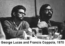
I have been slogging though a little 518 page gem called "
Droidmaker: George Lucas and the Digital Revolution" by
Michael Rubin. Even though it is longer than "
Harry Potter and the Half-blood Prince", it is a really good read. The book ventures in territory rarely explored, as Rubin--a former member of the Lucasfilm Computer Division--reconstructs the events in Hollywood, in Silicon Valley, and at Lucas' private realm in Marin County, to track the genesis of modern media. Rubin has great access to images and key participants from Lucasfilm, Pixar and Zoetrope Studios--from George Lucas and the executives who ran his company, to the small team of scientists who made the technological leaps. What is making this book fun is the human scale of people pushing technology and the almost incestuous connections between the visionaries of late 20th Century filmmaking. Rubin weaves a tale of friendships, a love of movies, and the ever-constant arc of technology. Really I had no idea the interrelationships between
Lucas,
Spielberg,
Scorsese,
Coppola,
Walter Murch and
Verna Fields. Many went to film school together, and they all hung out in San Francisco working on each other’s films. In addition, I have been a huge fan of folks like
Alvy Ray Smith (who invented computer paint systems and such standards as the alpha channel in graphics) and
Jim Clark (who founded
SGI and co-founded Netscape.)
Of particular note, Rubin points out repeatedly that Lucas hates to write scripts and has a very difficult time scripting dialogue. Funny how some things never change. When sitting though “
Star Wars Episode III” I caught myself laughing out loud at the lame dialogue between the characters. Now I understand why. You would think with his resources he could find a decent scriptwriter. Guess it is all about the effects.
Rubin's book is chock full of trivia and Rubin really knits all the disparate parts together. If you have any interest in films, computers, technology or animation, I really recommend this book.
Shine On
OK, since I am still on a steep learning curve for embedding flash video in this site, I thought I would pass along a link to one of my favorite examples of how editing can tell a story.
This clip turns "The Shining" into the "feel-good movie of the year." I find it a very clever send-up.
Just me noodling with compression
Ignore this post. Really. It is of no consequence. For years I have used Quicktime and WindowsMedia to compress my media for the web. The Macromedia bundle for class had FlashVideo so I have been hammering on it a bit to see if I can stream files better, or faster, or perhaps with a more ubiquitious viewability. As I said, just me noodling with compression. First I want to test to see if this
home movie of my kids when they were little will work, and then I want to see if this big honking file I did about glass artist
Preston Singletary will work. If you are only going to watch one of them, I would watch Preston. It at least has some redeeming social value. You are ignoring this, right?
Alas, still not working. Guess I need to check my site settings. I think I missed something.
Update
February 6, 2006Well I believe I have made some technical discoveries about my inability to get these files to stream. It appears, but I am not certain, that blogspot is restricting me from nesting the html I need into this site. I can't seem to hide the code and get the video to play. Go figure. But I do have these files on separate pages. You can use the links above or these below. Sorry for the confusion, but I guess the learning curve was steeper than I expected.
Triple Forte FortPreston Singletary
Ya gotta' have'a plan
To be honest, to have a great understanding of this week’s readings for the entire class, mosey on over the
Erica’s site. I think her connection and context of the ideas presented in the “Blueprints” and “Hierarchy” articles is spot on. Anything that I add here will be of nominal consequence. But that has never stopped me from prattling on before, so why start now? And one other thing, sorry for this post being so damn long. Nothing like distilling five articles into one. Here I go…

Of the two general class articles,
Christina Wodtke says that if you don’t have a plan you are lost. Do card sorts, observe the subjects as they sort, look for dominant organization schemes, adjust your plan, and throw out what does not match. Simplify and keep the architecture transparent to the user.
Margo Halverson amplifies that notion by saying that the heart of good design is the concept of hierarchy, what do you want the user to see first? And minimize the clutter on the site.
Of the three additional readings for group 2 this week, Jason Withrow’s report on the “
Cognitive Psychology and IA: From Theory to Practice” was the most practical. Like Wodtke’s article, he is a firm believer in doing card sorts (both open-ended sorts where users freely put cards where they like and closed card sorts where they put cards into predefined categories.) Withrow believes the best advice when designing the architecture of your web site is try to accommodate as many different categorization approaches as possible, while supporting the most common approaches. Once the different approaches to categorizing the content is apparent from the card sorting exercises, it can be incorporated into the different facets of the interface.
He points out that visual clues are often the basis for the mental associations users make among items on the interface. He reinforces the Gestalt rule of proximity where items close together are perceived as being related. When this is tied into short term memory and how users navigate a site, navigation bars should group similar actions together, and a user should be able to visually scan and differentiate the “signal” from the “noise”. In other words, they should be able to easily select their desired item from all the surrounding items. He concludes his article by reminding the reader that consideration of mental categories influences how content is organized, while factoring in visual perception, memory, semantic networks, and learning helps to guide the designers as labeling and interface decisions are made.
Curt Cloninger’s
article on the differences between usability experts and designers was rather amusing. After months of dry and supercilious academic articles on everything from soup to nuts, his irreverent tone was a pleasant change. Granted, he was trying awfully hard, but I’ll cut him some slack. It was the first article I have read while in grad school with Joni Mitchell lyrics. He went into some detail describing the conflict between the Usability/Information Architecture camp (the “Mars” crowd) and the Graphic Designers (the “Venus” crowd.) The overarching point in his paper is that the web is just too big for one paradigm to prevail over another. It does not need to be seen as simply a high powered data base or an artistic branding experience. He goes on to say that “New Media” merely brings this dichotomy into renewed focus because of its newness. The vocabulary of the web is being invented every day. He also points out that most usability studies are created by people who define the study within the constraints of their paradigm, and consequently, the results are skewed to a data-centric viewpoint. They ask if someone can find something on a site, but fail to ask how much fun it was, or how they felt when they were there and what was the story.
Luke Wroblewski’s article about “
Visible Narratives: Understanding Visual Organizations” was a really great read. Of course, I say that as a frighteningly right brain kinda’ guy. Certainly Cloninger would describe his article as intuitive, focusing and defining the emotional. He’s more a developer of the Venus sort. I’ll borrow liberally from his article as I give you the gist. But I recommend it if you have a moment.
Wroblewski really does not see any reason for the
art vs. engineering and
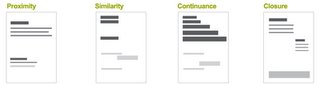
aesthetics vs. usability debate. He points out that a website can’t take sides: it needs both to be successful. A rather obvious conclusion, but after all the bizarre meetings I have sat through over the past few years it appears the message is getting lost somehow. All too often I find myself sitting at a conference table surrounded by neophytes and dilettantes who can’t understand what the other side is talking about. Why can’t we just all get along? With the power of all the great tools we have available to us as architects and designers comes responsibility. And in this case, the entire team needs to understand how visual information communicates with an audience. Wroblewski believes that Visual communication can be thought of as two intertwined parts: personality, or look and feel, and visual organization.
To start with he defines how we see visual relationships. Proximity, similarity, continuance and closure. This is reflective of the reading last week on how the
HCI principles relate to the
Gestalt Theory and that both recognize the importance of patterns.
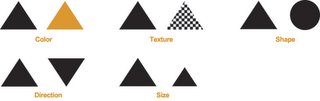
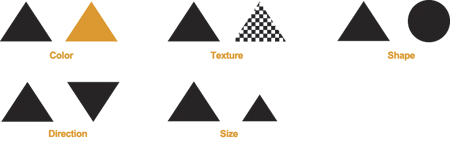
We can group distinct visual characteristics into five general categories: color, texture, shape, direction, and size. Introducing variations in one or all of these categories creates visual contrast.
His next point was that we can use visual hierarchy to tell a story. Designers clearly communicate ideas through the organizing and manipulating of words and pictures. “Elements within a ‘visual narrative’ are arranged in an easily understood order of importance. A center of attention attracts the viewer’s attention, and each subsequent focal point adds to the story.” This logical ordering is known as a visual hierarchy.
So as to not blatantly steal every element from Wroblewski‘s article, I have created variations below to amplify his point. The photo on the left has a lot going on in it. It is graphically a rather busy image with lots of detail. You can select the image by clicking on it for a larger view.


The grey circle on the white background is rather muted and the lack of contrast minimizes its importance in the frame. The red text on a white background is simple and a significantly contrasting graphic. Your eye will know exactly where to go and will understand that the point is important. While the two graphics are far simpler to quickly understand, the photo will keep your attention for longer because of the details in the image. Visually dominant elements (those with the heaviest visual weight) get noticed the most.
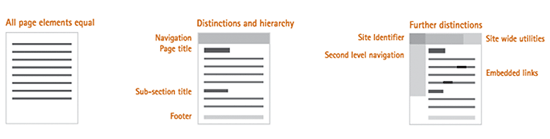
Once your audience understands the significance of your page elements, they can apply that knowledge to the rest of the site. The hierarchy of a web page is based on distinctions between the content, navigation, and supporting information on a page.
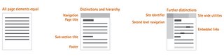
Wroblewski is not absolute in mandating that these are the golden rules for successful visual communication. I guess we can think of these more as guidelines. The content, audience, and goals of each page should determine its exact hierarchy. Nonetheless, he believes that the visual representation of each element on a web page should always be:
• Appropriate for and indicative of the element’s function
• Applied consistently throughout the site
• Positioned properly in the page’s visual hierarchy (in a manner reflective of its relative importance)
What I carried away from this article is that visual hierarchy can provide users with a sense of where they are within a website. It can educate and guide an audience through their navigations by directing their attention without shouting at them.
And what I carried away from all five of these articles is have a plan. Set your emotional, narrative and informational priorities up front. Find the balance between architecture and design. And above all, listen to what the users are telling you. If they don’t like the site they are not coming back.
History with an attitude
I thought I would add some more media to this site. Just random odds and ends that revolve around history.

Seattle was founded in 1851, which is not a long time ago geologically speaking, but is older than other communities with many more designated landmarks than we have. Seattle has a significant history, important to the country, and a sizable heritage community who knows and cares about it. This first video is from a documentary I worked on about icons that are no longer here in Seattle. Subjects included Fredrick and Nelson department store, the Kalakala ferry, Bobo the gorilla and this story about the
streetcars and cable cars that used to motor along the neighborhood streets. It ran on KCTS about 8 years ago. Unfortunately there is a typo in my artwork so I have to fix that tonight. Typing too fast for my own good.
 Myth America
 was a series produced for Discovery/TLC. The premise of the entire series was a review of the history that we were not taught in school. This particular episode focused on one topic you never heard about in history class -- I'll let you guess. In this rather irreverrent series, historian Rick Shenkman explains why Americans are fond of myths and he clarifies who's behind the falsehoods. His research shows that many of the myths are the product of a concerted campaign in the 19th century to turn Americans into patriotic nationalists. Today the myths are perpetuated by government bureaucracies afraid of letting Americans in on the big secret. Schools are frightened of creating controversy. Tourist boards are scared of driving away visitors who come to see the shrines they learned to revere as children. Politicians quail before the powerful super patriotic groups that are determined to use history to advance their own biased agenda.
Thoreau said that we remember only what is important. But Americans seem to remember from their history all that's mythical. With time the facts fade. But the myths go on and on.
Links are here:
Myth AmericaSeattle Trollies


