Bad Design Blows
 The focus of this week’s readings all seem to boil down to this one common maxim: The customer is always right. In other words, it is of paramount importance to always keep the user in mind when developing a web site. Sure this should be a no-brainer. But how many web sites have you visited with some dreadful layout where you can never find what you want and it is all form over function?
If we are discovering anything in our class discussions (both as a body politic and in our competing teams) you have got to have a plan. The reading reinforces the idea that content for a web site needs to be organized in an understandable fashion (who is your audience?) and navigating the site needs to be seamless. The design (both graphical and architectural) cannot be distracting and should feel intuitive.
Greenzweig likens website navigation to the immersive experience of watching a film or listening to music. While I believe there are some parallels, I find there is an inherent difference between being lost in a story and lost on the web. Both emotionally and literally. Still, the notion of control has some relevance. A filmmaker has four principal voices available to manipulate a response in an audience: dialogue, music, images and sound design. As a filmmaker you are working to manage how moments coincide, reinforcing emotions and ideas through these intersections of coincidence. You shape and direct an audience where you want to take them. A web page not all that dissimilar. As a web site designer you need to consider how someone enters your site and guide them on a likely path. While certainly film is an intrinsically linear narrative and the web is inherently circular, you can work proactively to manage the voices you have available to shape the experience of the user. To be successful in either medium you always have to bear in mind the experience of the audience. And no matter what tool you use, lame design is still lame design. What good is it if no one can understand the message?
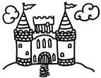
I am not certain I really ascribe to the notion in Web 2.0 of a borderless web. Commercial sites will always want to keep you inside the fortress walls. They spent a lot of time and money developing their content and they want to keep you there. The last thing they want is to have you surfing your dollars away to another site. The longer you stay the greater chance you will purchase something or will remember the brand. This notion strikes me as being similar to what I consider the rather naive notion of completely open source code. It costs time and money to create things and people need to make a living creating it. Companies need to answer to shareholders, and one of the things they need to justify is the return on their marketing dollars. It is not in their best interest to make it easy to leave their site. I cannot see what the big internet companies will gain by being just one more average tree in the forest. It all becomes more clutter on the screen. Certainly in the non-profit and information only enclaves a borderless web sounds enticing. But until big business sees a way to make a buck off it the castle walls will continue to be built higher and stronger.
posted by Drew Keller @ Tuesday, February 14, 2006
0 comments
![]()
![]()

