Ya gotta' have'a plan
To be honest, to have a great understanding of this week’s readings for the entire class, mosey on over the Erica’s site. I think her connection and context of the ideas presented in the “Blueprints” and “Hierarchy” articles is spot on. Anything that I add here will be of nominal consequence. But that has never stopped me from prattling on before, so why start now? And one other thing, sorry for this post being so damn long. Nothing like distilling five articles into one. Here I go… Of the two general class articles, Christina Wodtke says that if you don’t have a plan you are lost. Do card sorts, observe the subjects as they sort, look for dominant organization schemes, adjust your plan, and throw out what does not match. Simplify and keep the architecture transparent to the user. Margo Halverson amplifies that notion by saying that the heart of good design is the concept of hierarchy, what do you want the user to see first? And minimize the clutter on the site.
Of the three additional readings for group 2 this week, Jason Withrow’s report on the “Cognitive Psychology and IA: From Theory to Practice” was the most practical. Like Wodtke’s article, he is a firm believer in doing card sorts (both open-ended sorts where users freely put cards where they like and closed card sorts where they put cards into predefined categories.) Withrow believes the best advice when designing the architecture of your web site is try to accommodate as many different categorization approaches as possible, while supporting the most common approaches. Once the different approaches to categorizing the content is apparent from the card sorting exercises, it can be incorporated into the different facets of the interface.
He points out that visual clues are often the basis for the mental associations users make among items on the interface. He reinforces the Gestalt rule of proximity where items close together are perceived as being related. When this is tied into short term memory and how users navigate a site, navigation bars should group similar actions together, and a user should be able to visually scan and differentiate the “signal” from the “noise”. In other words, they should be able to easily select their desired item from all the surrounding items. He concludes his article by reminding the reader that consideration of mental categories influences how content is organized, while factoring in visual perception, memory, semantic networks, and learning helps to guide the designers as labeling and interface decisions are made.
Curt Cloninger’s article on the differences between usability experts and designers was rather amusing. After months of dry and supercilious academic articles on everything from soup to nuts, his irreverent tone was a pleasant change. Granted, he was trying awfully hard, but I’ll cut him some slack. It was the first article I have read while in grad school with Joni Mitchell lyrics. He went into some detail describing the conflict between the Usability/Information Architecture camp (the “Mars” crowd) and the Graphic Designers (the “Venus” crowd.) The overarching point in his paper is that the web is just too big for one paradigm to prevail over another. It does not need to be seen as simply a high powered data base or an artistic branding experience. He goes on to say that “New Media” merely brings this dichotomy into renewed focus because of its newness. The vocabulary of the web is being invented every day. He also points out that most usability studies are created by people who define the study within the constraints of their paradigm, and consequently, the results are skewed to a data-centric viewpoint. They ask if someone can find something on a site, but fail to ask how much fun it was, or how they felt when they were there and what was the story.
Luke Wroblewski’s article about “Visible Narratives: Understanding Visual Organizations” was a really great read. Of course, I say that as a frighteningly right brain kinda’ guy. Certainly Cloninger would describe his article as intuitive, focusing and defining the emotional. He’s more a developer of the Venus sort. I’ll borrow liberally from his article as I give you the gist. But I recommend it if you have a moment.
Wroblewski really does not see any reason for the art vs. engineering and aesthetics vs. usability debate. He points out that a website can’t take sides: it needs both to be successful. A rather obvious conclusion, but after all the bizarre meetings I have sat through over the past few years it appears the message is getting lost somehow. All too often I find myself sitting at a conference table surrounded by neophytes and dilettantes who can’t understand what the other side is talking about. Why can’t we just all get along? With the power of all the great tools we have available to us as architects and designers comes responsibility. And in this case, the entire team needs to understand how visual information communicates with an audience. Wroblewski believes that Visual communication can be thought of as two intertwined parts: personality, or look and feel, and visual organization.
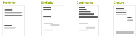
To start with he defines how we see visual relationships. Proximity, similarity, continuance and closure. This is reflective of the reading last week on how the HCI principles relate to the Gestalt Theory and that both recognize the importance of patterns.
We can group distinct visual characteristics into five general categories: color, texture, shape, direction, and size. Introducing variations in one or all of these categories creates visual contrast.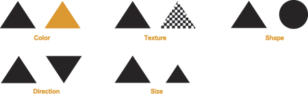
His next point was that we can use visual hierarchy to tell a story. Designers clearly communicate ideas through the organizing and manipulating of words and pictures. “Elements within a ‘visual narrative’ are arranged in an easily understood order of importance. A center of attention attracts the viewer’s attention, and each subsequent focal point adds to the story.” This logical ordering is known as a visual hierarchy.
So as to not blatantly steal every element from Wroblewski‘s article, I have created variations below to amplify his point. The photo on the left has a lot going on in it. It is graphically a rather busy image with lots of detail. You can select the image by clicking on it for a larger view.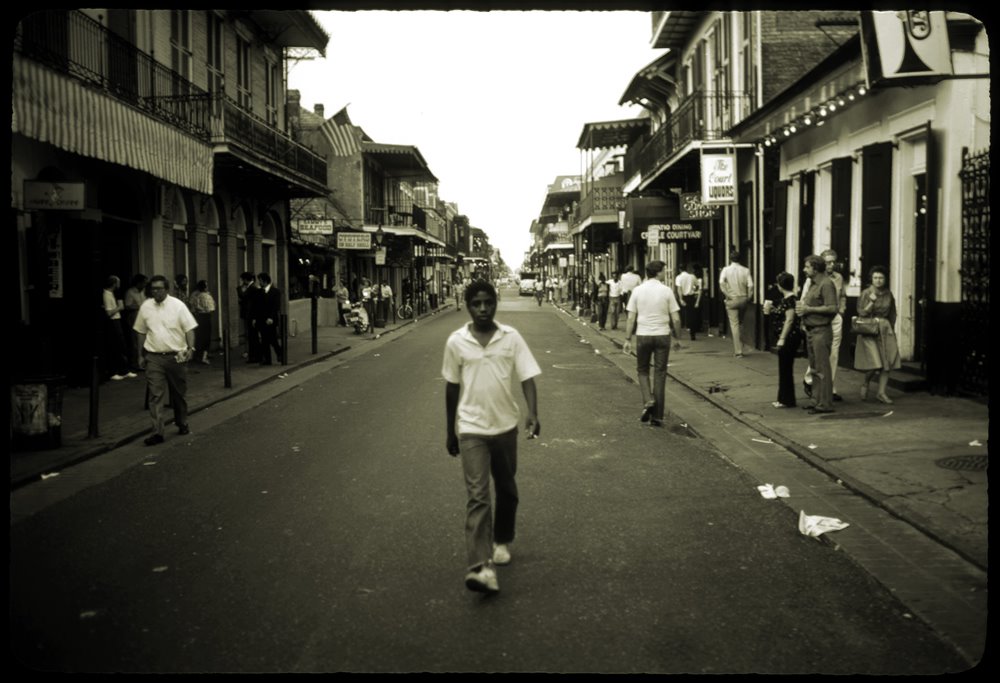


The grey circle on the white background is rather muted and the lack of contrast minimizes its importance in the frame. The red text on a white background is simple and a significantly contrasting graphic. Your eye will know exactly where to go and will understand that the point is important. While the two graphics are far simpler to quickly understand, the photo will keep your attention for longer because of the details in the image. Visually dominant elements (those with the heaviest visual weight) get noticed the most.
Once your audience understands the significance of your page elements, they can apply that knowledge to the rest of the site. The hierarchy of a web page is based on distinctions between the content, navigation, and supporting information on a page.
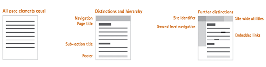
Wroblewski is not absolute in mandating that these are the golden rules for successful visual communication. I guess we can think of these more as guidelines. The content, audience, and goals of each page should determine its exact hierarchy. Nonetheless, he believes that the visual representation of each element on a web page should always be:
• Appropriate for and indicative of the element’s function
• Applied consistently throughout the site
• Positioned properly in the page’s visual hierarchy (in a manner reflective of its relative importance)
What I carried away from this article is that visual hierarchy can provide users with a sense of where they are within a website. It can educate and guide an audience through their navigations by directing their attention without shouting at them.
And what I carried away from all five of these articles is have a plan. Set your emotional, narrative and informational priorities up front. Find the balance between architecture and design. And above all, listen to what the users are telling you. If they don’t like the site they are not coming back.
posted by Drew Keller @ Saturday, January 28, 2006
1 comments
![]()
![]()